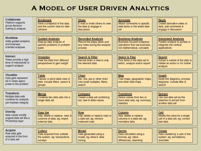
Here’s a diagram I threw together a while back breaking out the different parts of user-driven analytics. With automated analytics all the rage right now, I think there’s still a lot of untapped innovation and value on the user-driven side, and this diagram serves as my road map for building that out. Over the next couple months I’ll be talking about parts of this model, where Lab Escape is innovating in it, and where I see other opportunities for companies at the data, visualization and analytics layers.
For now, if you see parts you want me to elaborate on sooner, or have questions, post a comment or e-mail me.

Leave a Reply