To Hypothesize Or Not?

Steve Miller recently wrote an article entitled “Science of Business vs. Evidence-Based Management” in which he contrasts the hypothesis-driven philosophy of what he calls the Science of Business, which aims to support decisions by discovering business best practices using the scientific method, with the hypothesis-less philosophy of Evidence-Based Management, which aims to support decisions by looking for trends and clusters in historical data without any need to define a reason why that trend or cluster occurred.

The Science of Business he describes as a top-down approach while Evidence-Based Management he describes as bottom-up, driven only by data and not hypothesis. Steve asks whether this distinction is important for business intelligence. In this post, I argue that the distinction is important, that it applies to all decisions and not just those supported by business intelligence systems, and further attempt to define when each approach has merit.
Continue reading >

My Standing Desk Experiment: 3 Weeks Later

Three weeks ago my friend Jonathan Feldman re-tweeted this article about switching to a standing desk. I became immediately intrigued, cleared off a shelf and undocked my laptop.

The desk I work at is not adjustable, and while I briefly wrestled with the idea of propping it up higher with printer paper or cinder blocks, I didn’t want to completely give up my ability to work while sitting. Plus, while sitting increases the risk of lifestyle diseases, standing while working comes with its own set of health problems. Alternating between standing and sitting seemed to be the best idea. So I improvised.

Continue reading >

2011 State of the Union Visualizations: Charts, Graphs & Infographics

State of the Union VisualizationsThe enhanced version of last night’s State of the Union speech demonstrated the value of quality data visualizations. Chock full of charts, graphs and infographics, the visualizations reinforced the President’s message with a clarity and lack of chart junk rarely seen in presentations.

Whether you agree with the President’s assertions or not, or disagree with the biases presented in the charts (as all charts have biases), there’s no denying the beauty of the visualizations. As CEO of a data visualization company, it made me happy to see good visualizations being used in the public discourse.

Below I’ve collected the charts, graphs and select infographics from the speech last night. I excluded the infographics I felt lacked any data visualization components. Click on the image to see a bigger version. A link below each image will take you to the part of the speech displaying the visualization or you can tweet a link to the image.
Continue reading >

Snapshots Are Key To Good Analysis

Do you make your decisions using real-time reports? Does your dashboard only show you your current metrics? Do your metrics fluctuate from report to report?

Your data analysis may be wrong.

By comparing irregular time periods, reacting to normal fluctuations and not knowing the previous state of your data, you can make bad decisions. Snapshots address these issues by recording the results of a data query at a specific point in time. By taking snapshots on a consistent schedule, you can see what’s changed, compare equal time periods for improved analysis and stop reacting to normal fluctuations in your data.

Snapshots help you see what changed and what didn’t. They allow you to manage by exception, detect trends and, when done right, ignore normal fluctuations. In a world focused on real-time reporting, snapshots give you needed longer-term perspective.

Continue reading >

The Sunk Cost Dilemma

Do you ignore sunk costs when making decisions? Then you may be at risk for getting trapped in the sunk cost dilemma.

What Is A Sunk Cost?

A DilemmaA sunk cost is money, time or another resource that has been irretrievably spent. The hour you spent yesterday playing solitaire or the money you spent on dinner last night are sunk costs. You can never get that hour or money back.

Costs in the past are usually sunk costs, though not always. If you buy a sweater for your niece, you can return it and get a refund if it doesn’t fit. In this case, the cost is a retrievable cost rather than a sunk cost. It becomes a sunk cost only once the return period has expired.

Costs in the future can be sunk costs if they are, for all practical purposes, inevitable. If you sign a contract requiring you to pay $100 a month for a year, and there’s no way out of the contract, that $1,200 is a sunk cost because you’re legally obligated to pay the money. While you could default or declare bankruptcy, that usually isn’t an option.
Continue reading >

Bayesian Math for Dummies

Steve Miller wrote an article a couple weeks ago on using Bayesian statistics for risk management. He describes his friend receiving a positive test on a serious medical condition and being worried. He then goes on to show why his friend needn’t be worried, because statistically there was a low probability of actual having the condition, even with the positive test.

Understanding risk is an interest of mine, and while I’ve read articles about Bayesian math in the past, the math is above my head. I never studied statistics, nor do I plan to. But I am interested in the concepts behind statistics, so I can understand probabilities better. And I can do basic math. Steve’s article was dense with math I didn’t quite get, but I was able to translate it into something I could understand.

So now, for statistically challenged individuals, I present my translation of Steve’s calculations, Bayesian math for dummies.

Continue reading >

7 Business Card Tips for Successful Networking

HandshakeYou’re attending an industry networking party. At the end of the night you run into the CEO of a company you’ve been trying to get in front of for months. He’s about to leave, but you get two minutes to introduce yourself and hand him your card.

Two weeks later you still haven’t heard from him. Did he lose your card? Was he just being nice? Maybe he’s too busy. Could it have been your card?

Continue reading >

Visualizing Big Data

100,000 rows - heatmap of Java source code A couple of weeks ago I was asked about how visualization related to Big Data. I am far from a Big Data expert, but I know the basics and have been studying and selling visualization solutions for the past seven years. This article describes my thoughts on visualizing Big Data, not as a definitive statement, but as an exploration of ideas. Continue reading >

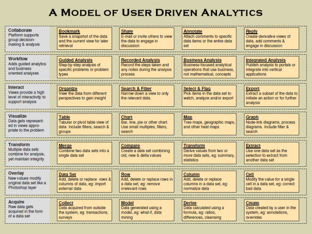
A Model of User Driven Analytics

Here’s a diagram I threw together a while back breaking out the different parts of user-driven analytics. With automated analytics all the rage right now, I think there’s still a lot of untapped innovation and value on the user-driven side, and this diagram serves as my road map for building that out. Over the next couple months I’ll be talking about parts of this model, where Lab Escape is innovating in it, and where I see other opportunities for companies at the data, visualization and analytics layers.

For now, if you see parts you want me to elaborate on sooner, or have questions, post a comment or e-mail me.

A Model of User Driven Analytics

The Go/No-Go Decision Pattern

Should you accept a new project a potential customer is offering you? Should you hire an assistant? Should you buy a friend’s beach house as an investment property?

These are all examples of the Go/No-Go decision pattern. Go/No-Go decisions belong to a family of dual-choice decision patterns that are used when making a choice between two options. The Go/No-Go pattern deals specifically with dual-choice decisions where:

  • The Go option involves an ongoing commitment of resources, e.g.: time or money.
  • The No-Go option involves no additional commitment of resources.
  • Choosing the No-Go option has the same effect as if the decision never occurred.

You can think of the Go/No-Go decision as deciding whether to stay sitting under a tree, or to walk down a path. Continue reading >

Older posts «

» Newer posts