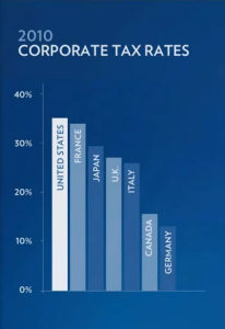
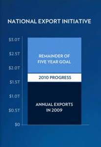
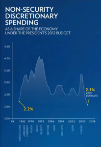
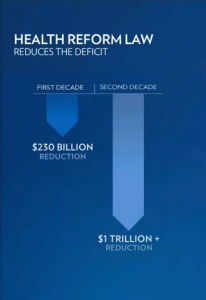
 The enhanced version of last night’s State of the Union speech demonstrated the value of quality data visualizations. Chock full of charts, graphs and infographics, the visualizations reinforced the President’s message with a clarity and lack of chart junk rarely seen in presentations.
Whether you agree with the President’s assertions or not, or disagree with the biases presented in the charts (as all charts have biases), there’s no denying the beauty of the visualizations. As CEO of a data visualization company, it made me happy to see good visualizations being used in the public discourse.
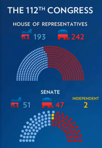
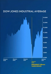
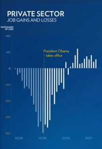
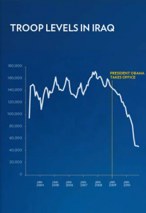
Below I’ve collected the charts, graphs and select infographics from the speech last night. I excluded the infographics I felt lacked any data visualization components. Click on the image to see a bigger version. A link below each image will take you to the part of the speech displaying the visualization or you can tweet a link to the image.
If you didn’t get to see the enhanced version with the sidebar displaying additional information, you can watch the full version on YouTube.
Update: People have pointed out some of the visualizations have design flaws. See the end of this post for corrected images and discussions of these flaws. I’ll try to update this section as people add comments.
What do you think of these visualizations? Post your comments in the comment box below the images.
Corrected Charts
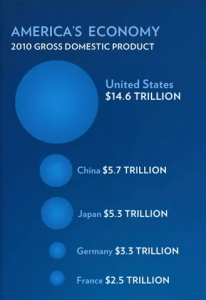
As pointed out by others, the circles used in the 2010 Gross Domestic Product and Tax Cuts for the Weathiest Americans charts may deceive viewers because the differences in areas don’t correspond to the differences in the numbers presented. Below are corrected versions of these charts with descriptions of the specific flaws.
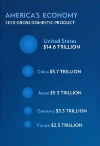
2010 Gross Domestic Product
In the 2010 Gross Domestic Product chart, the radius of each circle has been scaled based on the size of each nation’s economy. This distorts the perception of the relative sizes of the circles since the radius scales linearly, but the area scales quadratically. Basically, the size of the United States economy appears much bigger than it should.
The correct approach scales the area relative to the size of each economy, not the radius. This presents a more accurate view of the data based on the way we perceive circles. Below you can see the original chart (left) along with a corrected chart (right) which sizes each country based on the area rather than the radius.
For a detailed discussion on this chart, check out Obama Botches SOTU Infographic, Stock Market Reels. For details on the issue of using area vs radius to size circles, see Linear vs. Quadratic Change and A Simple Visual Perception Experiment.
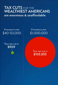
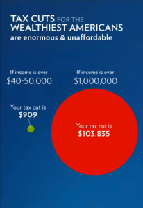
Tax Cuts for the Weathiest Americans
The Tax Cuts for the Weathiest Americans chart suffers from the opposite problem. The circle is too small–the area of the circle representing tax cuts for people making over $1 million should be bigger. Below the original chart is on the left with the corrected chart on the right.
Did you think the President did a good job with these visualizations? Do you see any other problems with the visualizations? Post your comments below.
 Watch In Speech
 Tweet This


9 comments
Nancy says:
January 27, 2011 at 12:11 am (UTC -4)
These are great charts!
Ryan says:
January 27, 2011 at 2:34 am (UTC -4)
The 2010 Gross Domestic Product graph is still mis-leading. The circles have shading that leads you to believe you’re looking as spheres, not 2-dimensional circles. Since spheres communicate volume, the largest circle should be further rediced in size – or the shading should be changed.
Overall, however, I really like the visualizations.
Ryan of Issaquah, WA
trevor says:
January 27, 2011 at 10:49 am (UTC -4)
An interesting point Ryan. Though I would argue that our visual systems are poor at detecting (and thus comparing) volumes so in a 2-D visualization, even if the circles are shaded, they should be sized based on their area. In a 3-D representation, where the user can walk around the objects and see them from different perspectives, then volume becomes important.
But you’re right, in an ideal chart you wouldn’t shade the circles so there was no implication of them being spheres.
Dudeman_101 says:
January 27, 2011 at 3:33 pm (UTC -4)
GDP is a misleading and useless marker anyway, as it assumes some connection between amount of money and quality of life, which is fundamentally wrong. While you and I have been blessed with big screen TV’s, steel-belted radials, and many other modern conveniences thanks to the capitalist system, it does nothing for the whole of humanity. Our schools, penal system, banking system, and every other institution in this country (and, thanks to globalization, the world) are starting to fail because infinite growth, the only possible way of sustaining an economy like ours, is unachievable. 80% of US jobs are in the service industry, producing nothing and so adding nothing of substance to the lives of anyone in this country. Sustainable production is the only ways to ensure that we have enough for everyone at all times, and it is also the enemy of our consumption based lives. Companies don’t make money from making products that, say, don’t break down, or are not obsolete after 3 months. The financial system you and I live in was designed to do one thing and one thing only- Keep the rich rich, and the poor poor, something that it does very well. It is not designed to create equality, promote sustainability, or solve societal problems. You don’t believe humanity is capable of living relatively free from crime and poverty? With the state of technology today we certainly can, but not if 1% of the population has 40% of the wealth. I don’t really like hippies either but they’re FUCKING RIGHT. It is only a matter of time before we just cannot do it anymore, and then what? Our FAKE economy collapses, factories go unutilized, and people starve in the streets because they can’t get enough money, which in reality is just a piece of paper with some ink on it. Sound like madness to you? Wake up and smell the coffee people. If we don’t change we’re doomed.
Math Matician says:
January 27, 2011 at 10:48 am (UTC -4)
I believe you mean “quadratically” rather than “exponentially”.
trevor says:
January 27, 2011 at 11:22 am (UTC -4)
Thanks for the clarification. I’ve long forgotten there was a difference, but you are right, it should be “quadratically” rather than “exponentially”. I just corrected it in the post.
For other interested in the difference, check out A Quick Guide to Recognizing Linear, Quadratic, and Exponential Functions.
Neal says:
January 27, 2011 at 12:35 pm (UTC -4)
Extremely useful post!!
Dan Meyer says:
January 27, 2011 at 2:09 pm (UTC -4)
Thanks for the nod, Trevor, but also for pulling out all the infographics from Obama’s speech. Great resource.
Stella Lau says:
March 31, 2011 at 2:40 pm (UTC -4)
I love that the data that matters most to us as a society is finally being put in data visualization form. Sure, the government can be more transparent by publishing raw data, but it usually doesn’t mean anything to the general public without putting it into context. These are beautiful visualizations that don’t sacrifice insightfulness for aesthetics. Great selection!